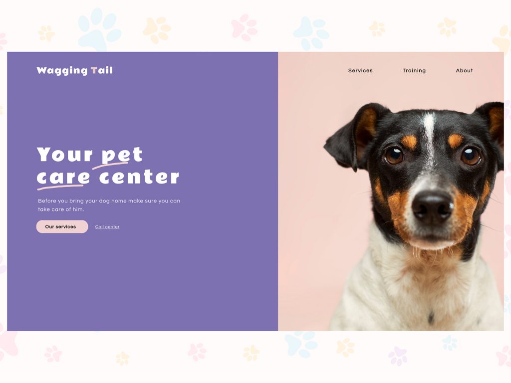
Once you have decided to create a pet home website, you need to do a bit of planning. That is something that you should do first. You should plan the website’s content, the basic layout, and the features you want to be there on the website.
Features you should include when you are designing a pet services website
There are different pet services, including grooming, veterinary medicine, pet care, pet stores, etc. There might be differences in the features that one pet service website might have with the other. Here, there is a list of some of the features that any pet service website might include:
- Professional-quality photos
- Well-written content
- Call-to-action
- Brand representation
- Contact information
The website should be able to represent the brand’s representation
Your brand should be very well-represented throughout your website. This means that the website should be designed in a way that will quickly tell you what the business is that it is representing.
- We did the following things on the website:
- We incorporate the logo and elements throughout the site
- We use the right fonts and colours for the logo and keep it simple.
- We also add relevant photos of the staff as well as the facility.
We use the right colour for the website. Use the right colours for the pet services website
Know the type of personality of the brand
There are four personality types that most people can be grouped into. The best thing is that each personality type also has a distinct preference for one of the four colour groups. You can tweak your brand and colours once you know your personality type.
Primary palettes are not for Premium businesses.
The primary colours include bright red, grass green, royal blue and bright yellow, if used together, might look a little cheap. It is, therefore, best to avoid doing so if you’re trying to build a premium brand. You can use one of these tones. But please do not use all of them together unless you want your brand to look super affordable.
Soften the blacks and warm up the whites
If you use a white background, you should try dark grey instead of black for the text. This is softer on the eye and causes less fatigue while reading. While reading it, you do not feel anxious. Instead, it is soothing to the eyes.
If you are not sure which color to use, you can opt for more earthly colours
You will observe that most pet service brands end up in the ‘Fireside’ Brand Personality type. Here, the earth tones reign supreme. This, however, does not mean you can’t use bright colours; however, more earthly colours are preferable.
Go with blue or purple.
You can opt for blue. This is an excellent colour for pet services, including pet training and sitting. These colours have a calming effect and are pretty mentally soothing. On the other hand, dark blue is associated with authority, trust and learning because it stimulates the mind. On the other hand, if the pet services you are creating a website need to convey happiness and fun, you can consider orange and yellow. Again, if the website represents cuddles, love and nurturing – light pink should be the colour you should select.
Contrast colours are good.
To check if your colours are accessible and easy to read, you can also use specific tools. You would require the hex code for white, light, bright, medium, dark, and black colours. It is also a good option for the website to use several colours rather than just 1 or 2. You can use them consistently in different ways and for different reasons in your brand. Contrast is essential to readability, ensuring that the readers spend more time browsing through the website.
We used the purple colour to design our Wagging tail website as our client wanted us to use a colour that gives a soothing effect.
How we created the pet service website?
To create a beautiful website, you will have to follow the steps mentioned below:
Design thinking framework
You can choose the Design Thinking Framework for the website, as it is the most common framework people use. Moreover, Design Thinking is the fastest and most holistic framework compared to the other frameworks.
Empathize
Before creating the user-centred design, you need reliable data that will validate what the actual user needs. Doing desk research will help you to get an existing insight on the internet, and by using Google Form, you will be able to get quantitative and qualitative data that will help in identifying the needs of the user that, includes the user pain points and solution prioritizing.
Graphic Designing
Another thing that you can do for your website is create a graphic design. You can create anything starting from creating icons, buttons, and also illustrations that will emphasize the message that you want to convey to the clients.
Conclusion
We try to understand the client requirements and create a website that will help him to attract more customers. We always ensure that the website we create provides good value for money and helps the client to reach his goal.

